
Isaac Alcober Crespo. Barcelona 1979
Professional Description
Art director and product designer, trained in a pioneering and leading company in the field of materials for urban artists. Extensive knowledge and experience in the complete process of planning, conceptualization, branding, and launching all types of projects, as well as collaborations with third parties.
- Skills
- Work Experience
- Featured Projects
Adobe Creative Suite (PS, AI, ID, etc.), Affinity, Blender, WordPress, and other digital platforms
- Catalan – Spanish – English – Portuguese
- Implementation of new technologies
- Creativity and observation
- Problem-solving
- Teamwork experience
Montana Colors (2004 – 2023). Art Director & Design
The bulk of my professional experience was developed at MTN, a pioneering brand of products for graffiti, art, and decoration. I played a variety of roles in the growth and consolidation of the brand as a global leader in its sector.
Web design, apps, and social media
Brand image development
Design and R&D of new products
Collaboration with artists and brands
Packaging, catalogs, and merchandising
Product Design
Allioli Fàcil
His name translates to Easy Alioli and is a simple modification of a kitchen utensil designed to enhance the experience of making this traditional sauce.
Lambasket
Concept, branding, and product design for a gadget aimed at the world of sour beers and natural wines. www.lambasket.com
Art From Chaos. Founder
Cultural production company where I participated in curating and publishing works by urban artists.
ArtNou – Galería Senda – “Debens Remix Sessions”
Sala Gaspar – Persiana Gaspar
SIXE / Blade – Limited Editions
Barcelona Homebrewing Society
President of the homebrewing association “BCNHBS,” coordinating monthly meetings. Organizer of the Beer Festival at La Deskomunal (3 editions – 40 breweries – 2000 attendees).
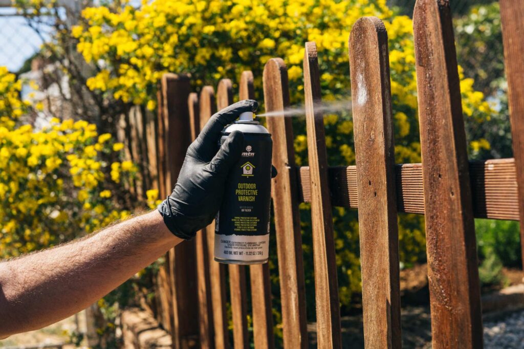
MTN WATER BASED
Q: How does a renegade graffiti brand break through to a wider artistic audience?
A: With a groundbreaking product and a solid strategy.
WATER BASED is a premium range of paint products, reformulated to replace petroleum-based solvents with water. This innovation greatly reduces the fumes and toxicity associated with spray paint products and can be used indoors, presenting opportunities for all kinds of contemporary art applications.
In order to reach that audience, I understood that we would need to adopt their language and industry standards. We chose colors and names with wide appeal, and created a variety of formats and sizes. Additionally, we provided labeling that corresponds with PANTONE and web based colors already familiar to arts and graphics professionals.
While WATER BASED was designed to expand our reach into new premium markets, the product line has also proven very popular with our urban arts clientele, thanks to its high quality and low odor profile.
MTN PRO
Montana’s PRO line was a natural next step in the evolution of our product family, expanding into professional, industrial, and technical markets. We developed specialized product lines tailored to different industries, allowing Montana to leverage existing production facilities to deliver premium products with excellent ROI.
However, we encountered a key challenge: entering this new market demanded adapting to different languages and customer needs. To succeed, we needed a bold overhaul of our branding strategy that preserved Montana’s aesthetics and identity.
I met this challenge by implementing three key strategies:
Creating a universal language of pictographs to be used in packaging, catalogs, and points of sale.
Developing systems for multi-labeling and drop-down labels with thorough consumer and product information in multiple languages.
Incorporating the use of QR codes, a fresh technology at the time.
These strategies allowed consumers to quickly identify their needs. The company was able to meet compliance with labeling standards across many languages and markets, resulting in a streamlined and cost-saving production process for the brand.
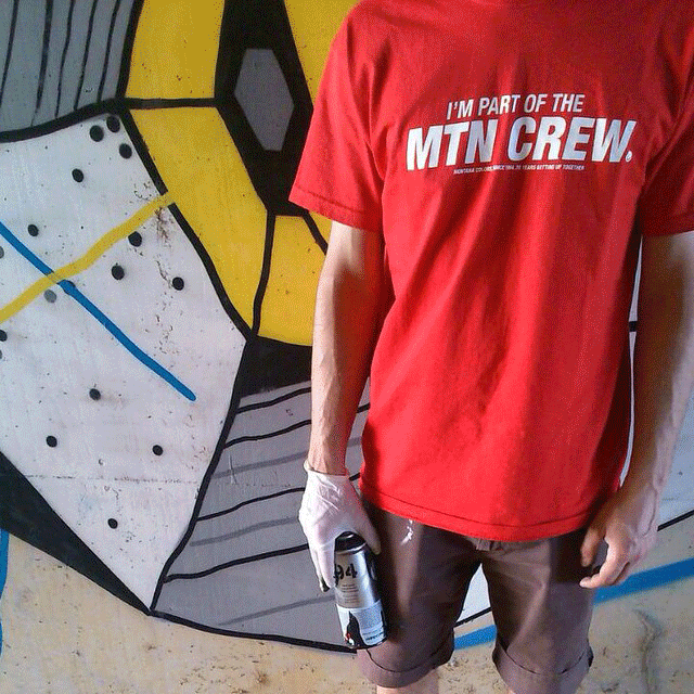
I’M PART OF THE MTN CREW SHIRT
When I joined Montana Colors, a short list of artists received sponsorship in the form of free paint. The program offered limited brand visibility in small circles, and had little impact on the global community of artists that used our products.
I saw an opportunity to unify our full audience with a merchandising campaign that would cement our brand’s place in graffiti culture, as well as create community among our users. I designed a tee shirt that reads “I’m part of the MTN CREW,” a punchy contraction of Montana, and “crew” a reference from graffiti culture.
We launched a revamped program, sponsoring artists with free paint and a MTN Crew shirt at local events around the world. The shirts quickly went viral, elevating brand awareness and creating overnight demand. The shirts became a badge of pride for our collaborators and fostered recognition between artists.
Over the years, hundreds of thousands of these T-shirts have been freely distributed, helping to build a dedicated and loyal fan base. They continue to be worn as a mark of self-identity in the urban art community.